New Unified Design Interface (UI Refresh)
We have introduced a refreshed, unified design interface across the GiveSmart Donor CRM platform. While all existing functionalities remain unchanged, you will notice a modern, consistent look and feel aligned with the broader MomentiveIQ product ecosystem.
This update focuses purely on visual and usability enhancements -No workflows or features have been modified. The refreshed interface improves clarity, consistency and cross-platform familiarity, making navigation more intuitive and the overall experience more seamless.
What Have We Updated?
As part of this UI refresh, we have applied enhancements across multiple components within Donor CRM:
Color Palette
Implemented a unified color palette across the system to ensure visual consistency, strengthen brand alignment and enhance usability.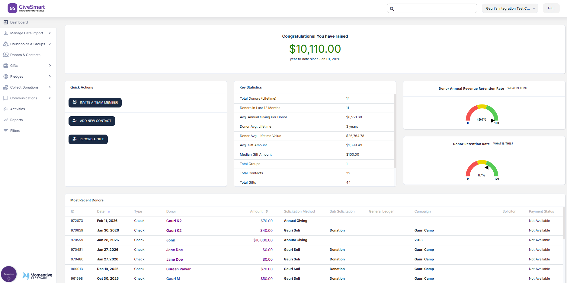
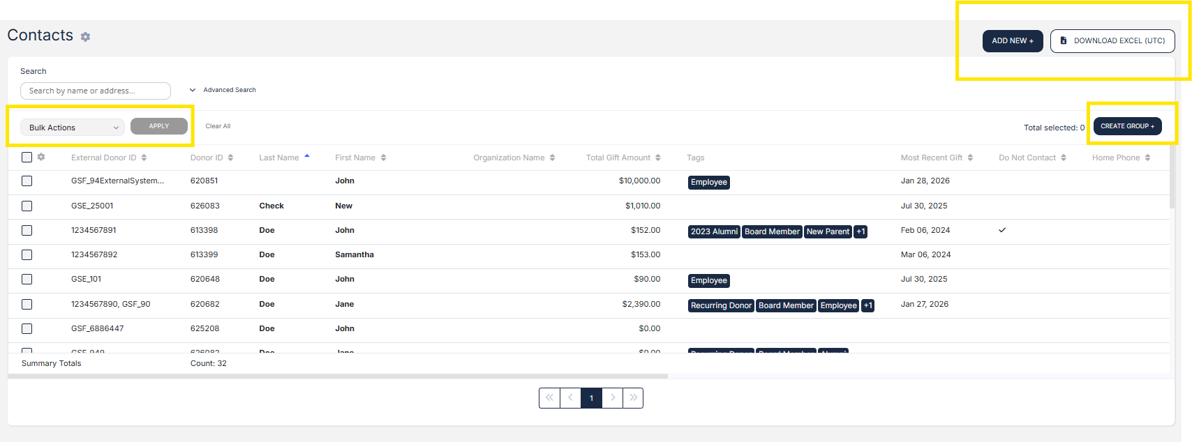
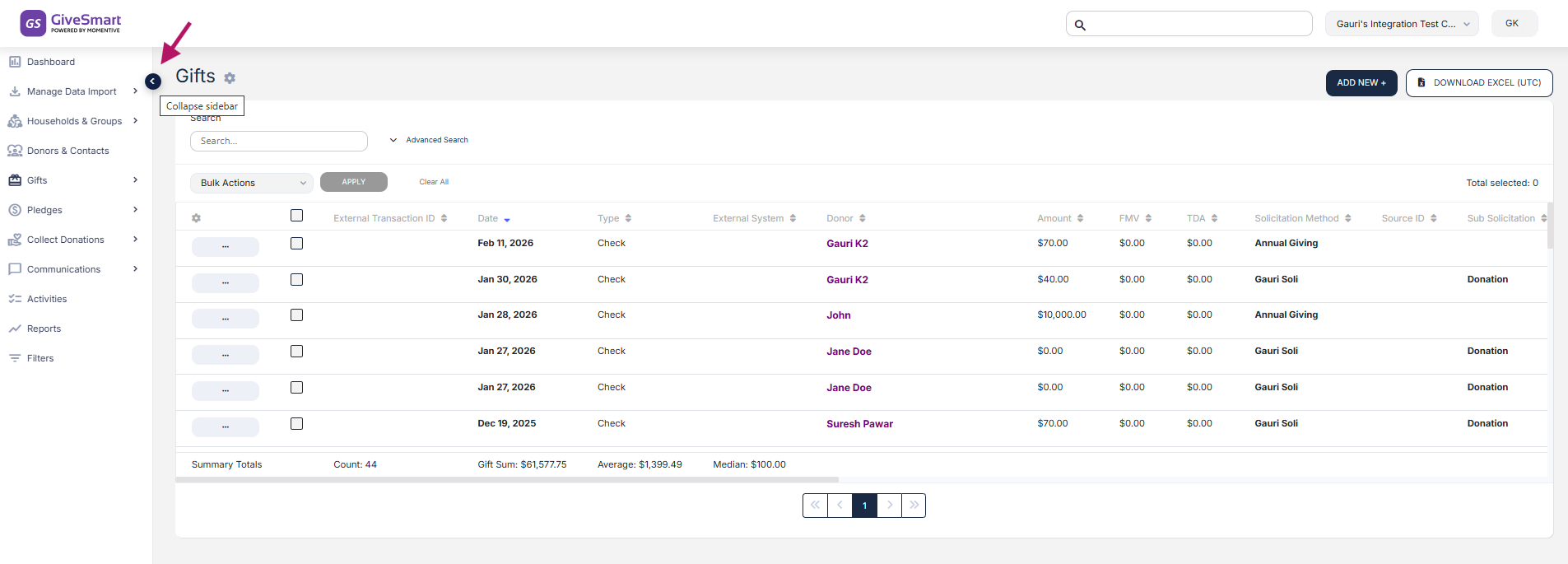
Global Header
Refreshed the global header with updated colors, iconography and layout standards to improve navigation efficiency and create a consistent experience across products.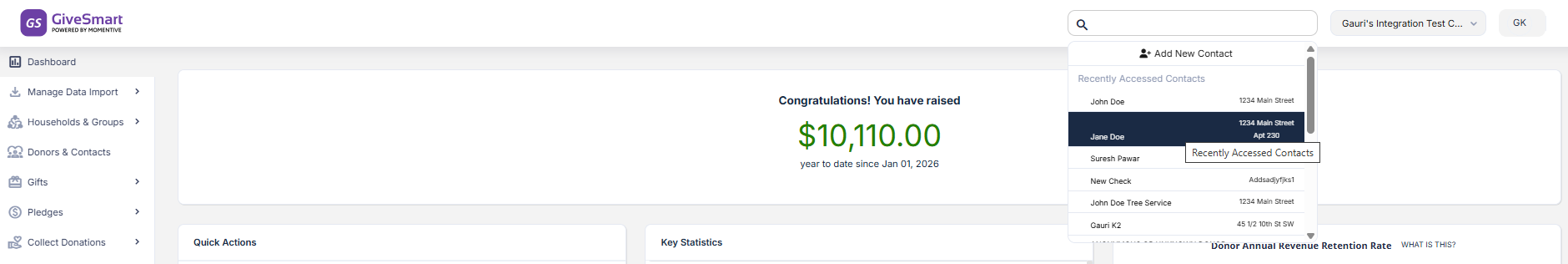
Left-Hand Navigation
Updated styling, typography and icons while retaining the familiar navigation structure to ensure ease of access without disrupting existing workflows.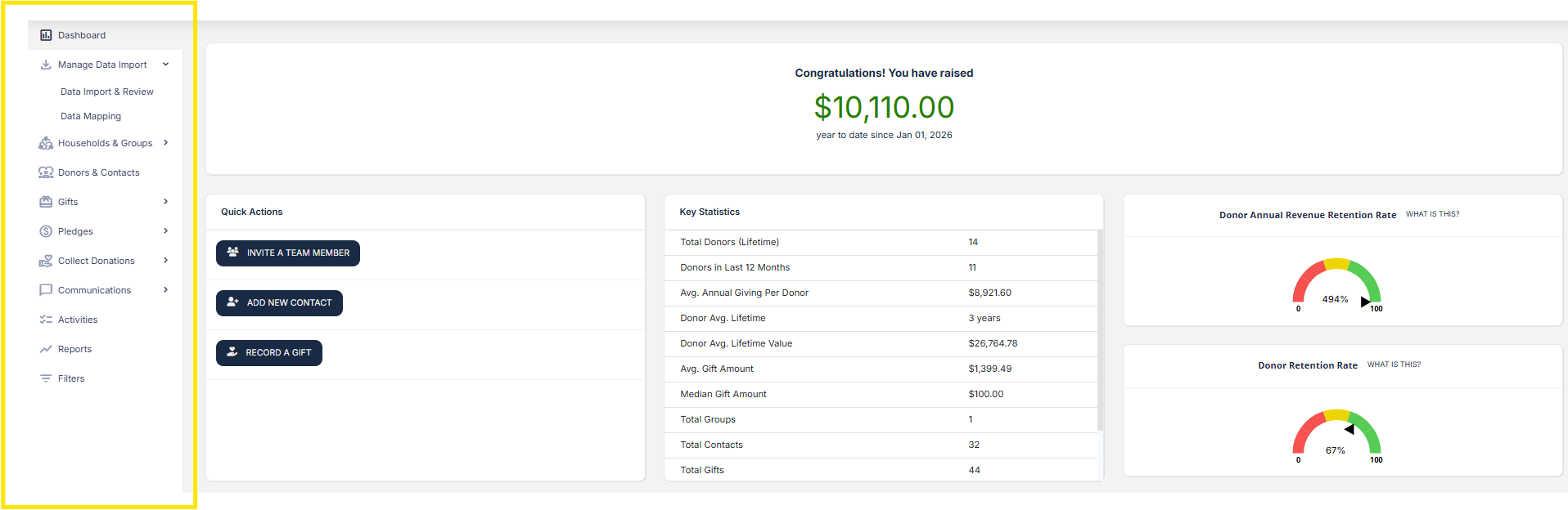
Buttons
Standardized button styling, sizing and placement across the system to promote clarity, consistency and user confidence.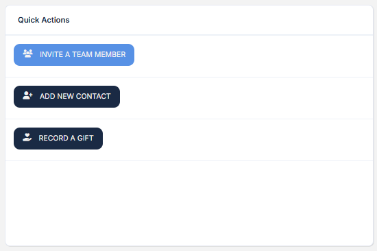
Search (Super Search)
Updated the UI of the global search feature to align with the new design system, making it easier to locate information in data-rich environments.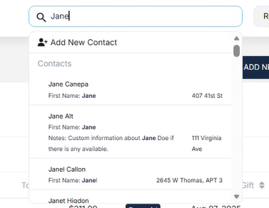
Tabs
Refreshed tab styles to ensure consistency across products and improve content organization and usability.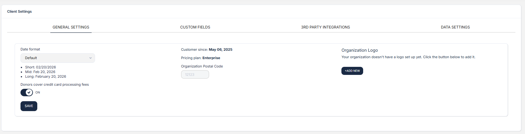
Icons
Updated all system icons to align with the Familiar UI design language, improving clarity and reducing the learning curve.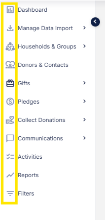
Expandable/Collapsible Sections
Standardized expandable components to provide a more consistent and intuitive experience, particularly in content-dense areas.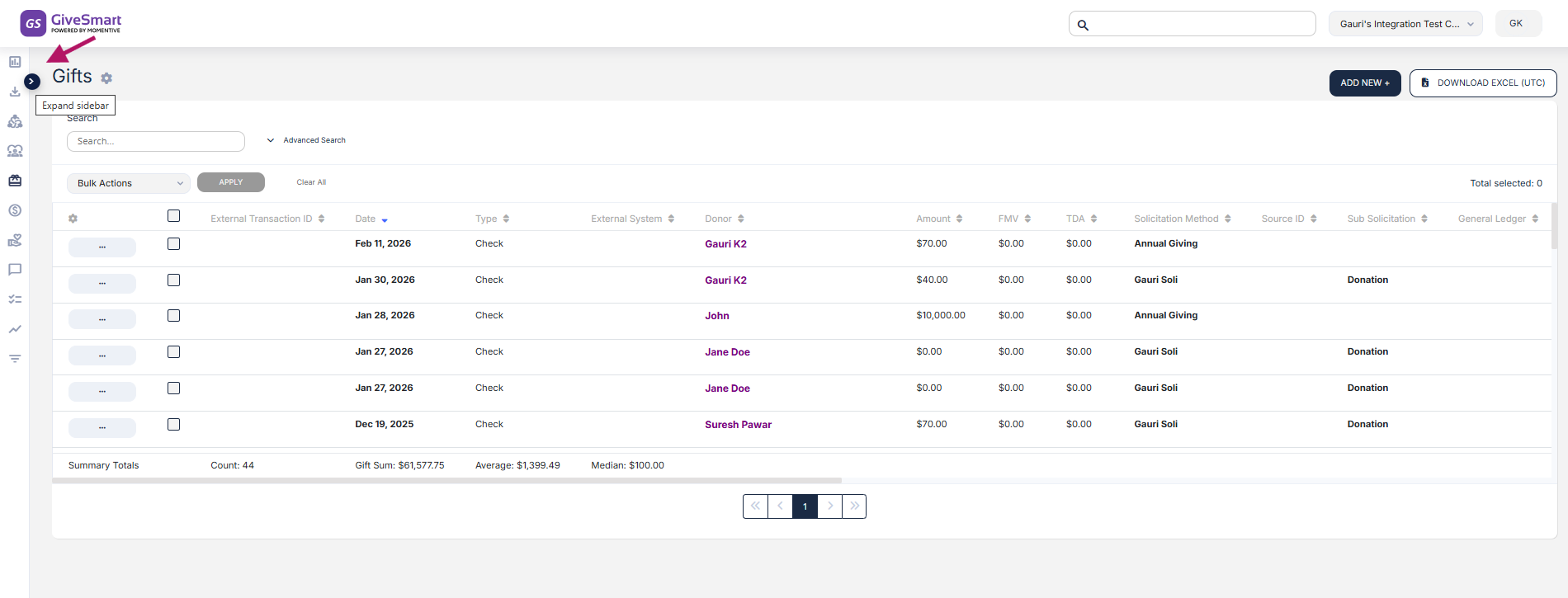
Fonts
Adopted the Inter font family as the default system font to enhance readability, ensure cross-platform consistency, and improve performance.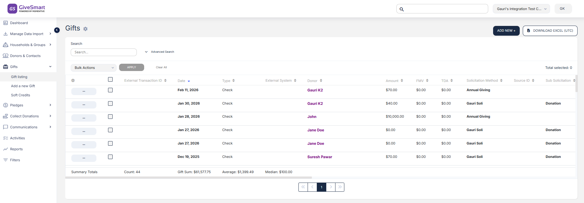
Progress Components
Updated progress indicators with the new color palette and typography to clearly communicate action status and improve user engagement.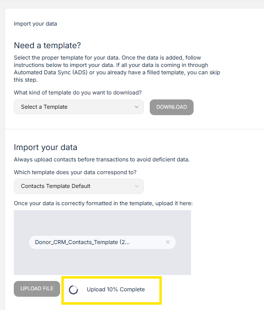
Additional Familiar UI Components
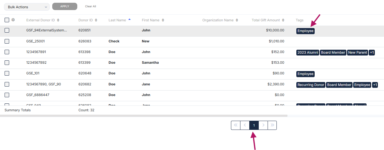
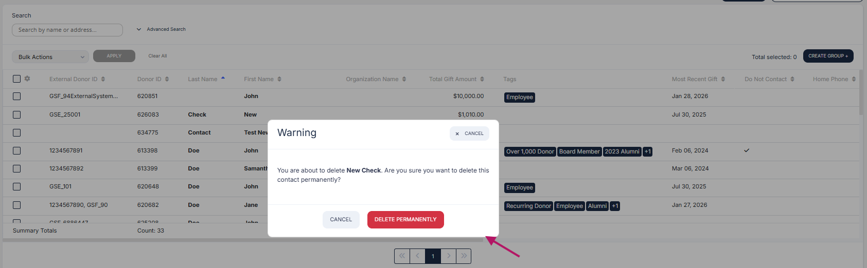
Refreshed various GiveSmart-specific components, including: Stepper, Cards, Input Fields, Checkboxes, Toggles, Radio Buttons, AutoComplete, Date Picker, Tags, Tooltips, Dialog Boxes, Select fields and Pagination controls.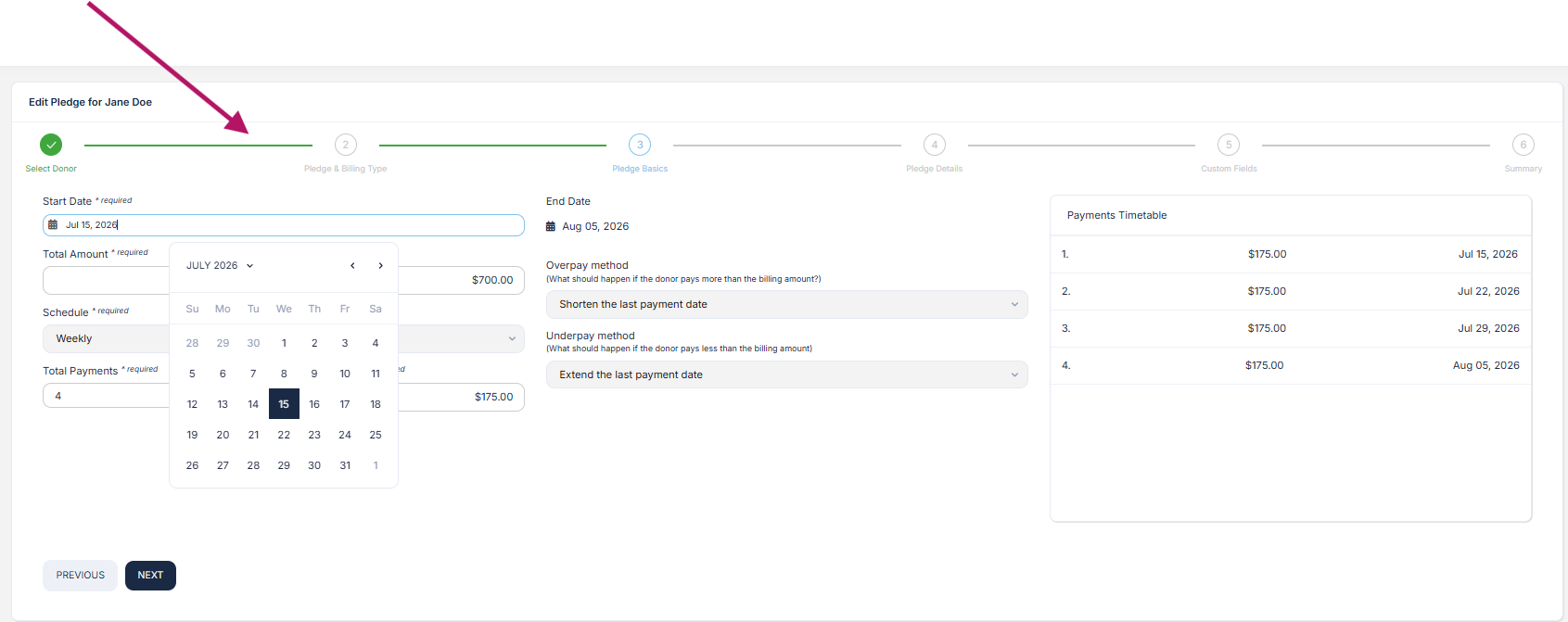


Who will see this new Familiar Design Interface?
The refreshed interface applies consistently across all user roles in Donor CRM:
Admins
Standard Users
(Frequently Asked Questions) FAQs:
1. Has anything changed functionality-wise within Donor CRM?
No. There have been no changes to any features, workflows, or system functionality. This release introduces a visual refresh only. All tools, actions and processes continue to work exactly as they did before—now within a more modern and consistent interface.
2. Who can see this change?
The updated interface is available to all Donor CRM users. This includes both Admins and Standard Users. The refreshed design applies consistently across all user roles to ensure a unified and seamless experience.
3. Can I switch back to the old UI?
No. The previous interface is no longer available. The new Familiar UI is now the standard experience across Donor CRM, designed to provide improved visual consistency, usability and alignment with the broader product ecosystem.
